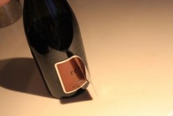
CUTTING EDGE: ABOUT THE METAL LABEL
For more than a decade, Lindsay Woodard has designed packaging for wineries around the globe. Her avant-garde designs have helped launched brands that achieved heightened perception within the market, chatter among the trade, consumers and media, while gaining instant credibility upon their Inaugural Release. Her strong creativity, high level of professionalism and depth of knowledge in the wine industry allows her to design brands that have distinction, purpose and integrity.
Upon creating a design for Retour, Woodard wanted a label that would showcase the identity, intellectual quality, weight, structure, complexity and texture of the wine. Determined to step outside of the expected norm with packaging design, she created a rare object of art and an aesthetic that has become a powerful icon. The sculptured metal label wraps around the bottle symbolizing the distinct personality and focus of the wine. It is a reflection of the meticulous work that goes into growing the grapes and making the wine. The raw material captures the purity and transcends the essence and fabric of Retour. Woodard, along with her mother, Leigh, apply each individual label by hand. Bouchon "Bou", a Bichon Frise, oversees the quality control of each label application.
The photograph as seen above, was featured in the San Francsico Chronicle:
"Peeling back the layers on one very big bottle"
